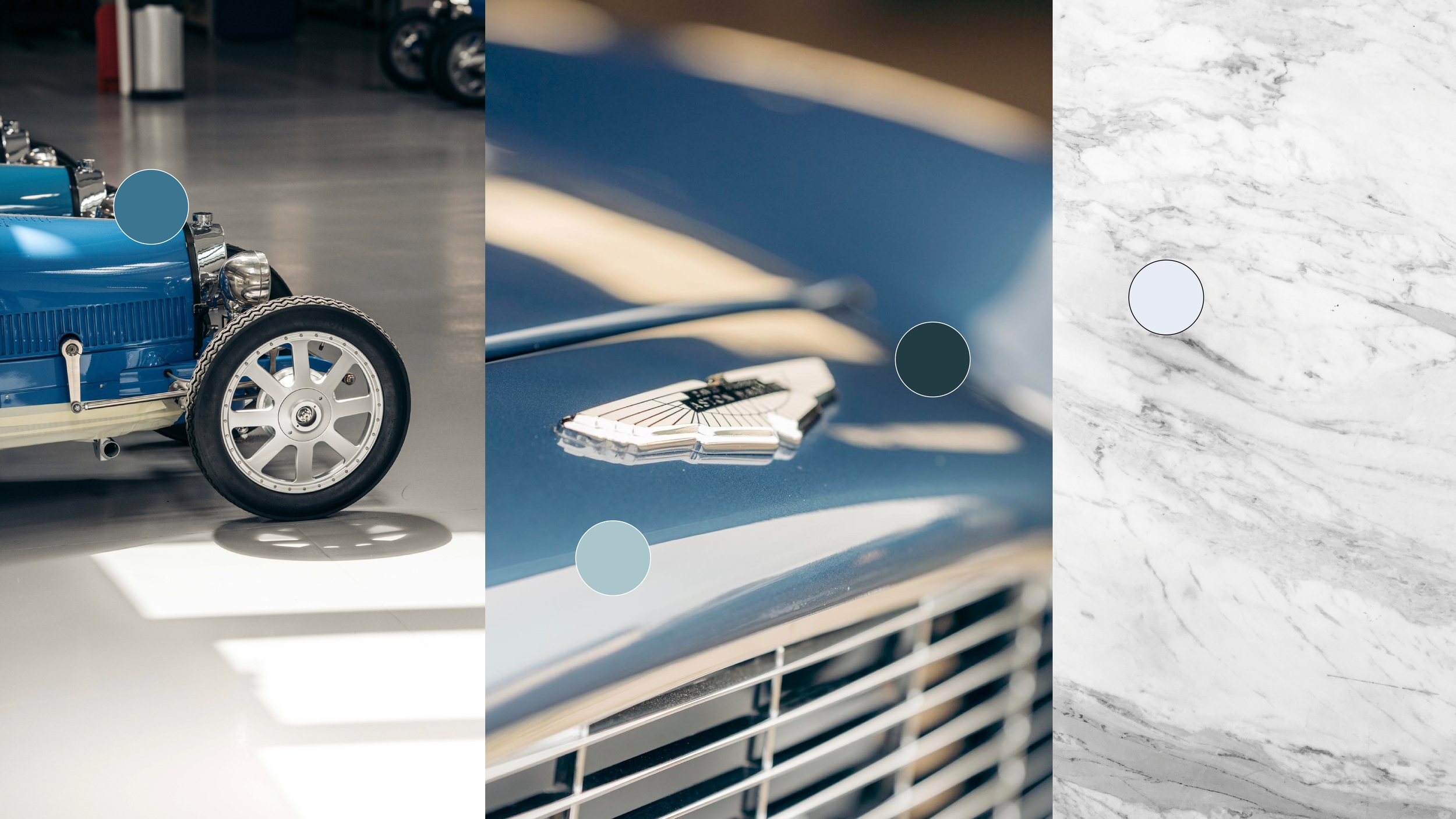
Using these brand colours across our communications helps us to present a consistent look to the world. Our palette has been designed to let the product photography take centre stage. We apply our colour with a thoughtful and subtle approach.
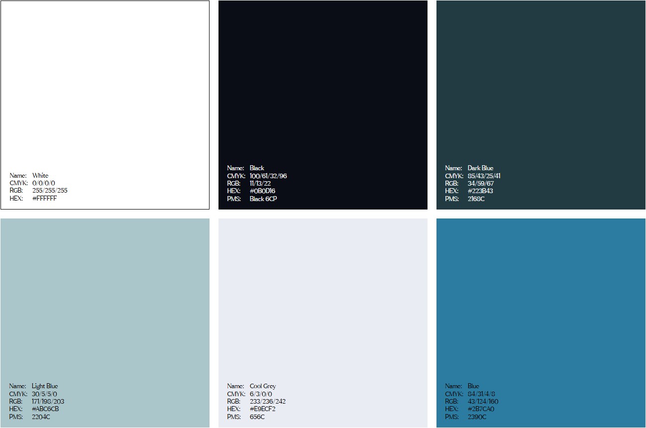
Colour palette
These are the breakdowns of our brand palette. CMYK and PMS (Pantone) are used for printed applications and we use RGB and HEX for digital formats. Never deviate from these colour breakdowns. Conduct tests on different screens and printed materials to ensure a high level of legibility.
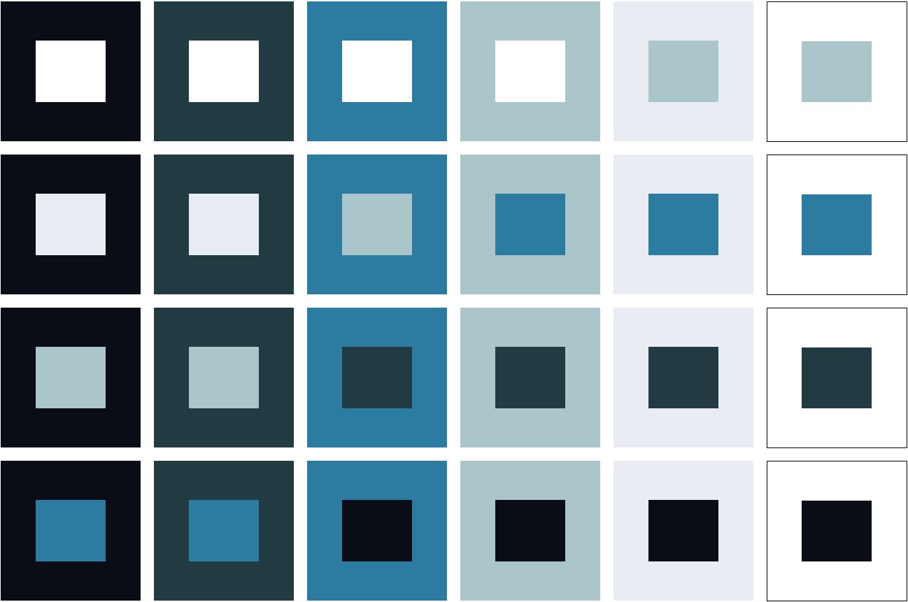
Combinations
Accessibility and legibility is a priority when it comes to colour. Some colours are not suitable for use in combination with others. The following diagram demonstrates approved colour combinations.
LEGIBILITY
Refined use of colour and contrast are key to our luxury approach to the Hedley Studios brand. Use the below legibility rules to guide your colour choice.